RSB Rigging Solutions rebrand
BRANDING • WEB DESIGN • LOGO DESIGN
the brief
RSB Rigging Solutions is an established superyacht rigging company based in Palma, Mallorca. RSB approached us to redesign and build their new website. During our early conversations, it became increasingly apparent that they were also in need of a total rebrand. As a result, we were also commissioned to rationalise their brand, which included the redesign of their logo. The brief was to create a solid, male biased identity which would be immediately recognisable and represent their position as an industry leader in a very competitive arena.
the solution
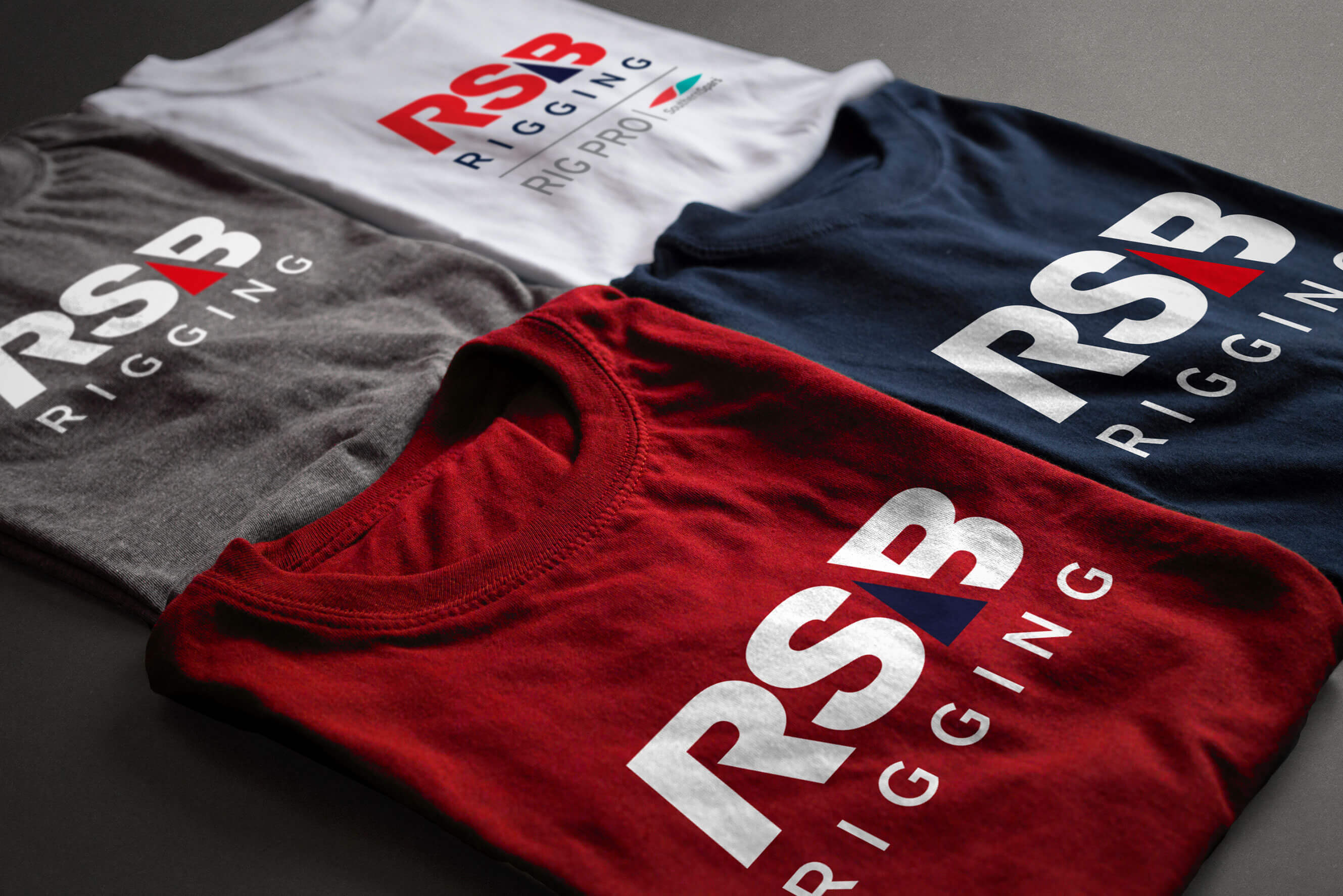
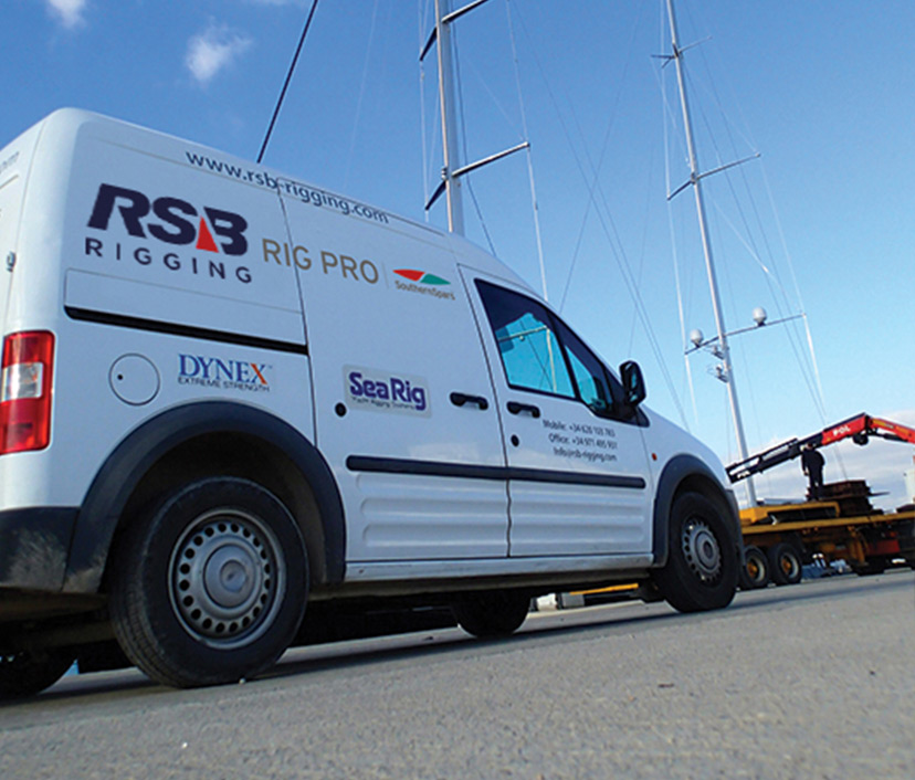
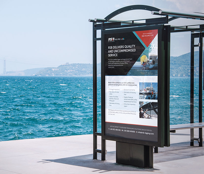
The redesigned logo, which is essentially typographic, represents the company perfectly, and it works seamlessly across all marketing, signage and apparel. The logo can be used as a positive in navy blue on a white ground, or reversed out, white on a dark ground. In both instances, the recognisable ‘sail’ element, which makes up a section of the ‘B’ remains the same bold red. There is also a secondary version in which the colours are reversed, when partnered with RigPro and Southern Spars. You can find the website we designed for RSB below.
View the site


